
A Checklist for Styling a Bookshelf Like an Interior Designer
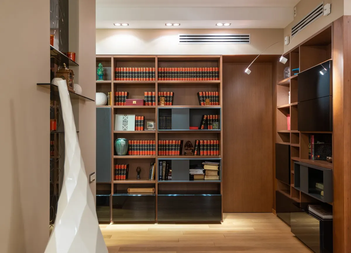
Few pieces of furniture promise more and deliver less than the humble bookshelf. You picture something calm and considered, then six months later it is a holding pen for birthday cards, orphaned chargers and paperbacks stacked two-deep. The good news is that a shelf that looks professionally styled is rarely the work of a bigger budget. It is the work of a few decisions made in the right order. Treat the checklist below as a sequence: work through it from top to bottom and the arrangement will come together on its own.
Start by Clearing Everything Off
You cannot style a shelf you cannot see. Empty every shelf completely and give the surface a proper dust and polish, since a dull surface flattens whatever you place on it. Then sort objects into three loose piles: keep, move elsewhere in the house, and let go. Be honest here. A shelf is not a storage unit, and anything you are keeping out of guilt is quietly dragging the whole display down.
Before you put a single thing back, decide what the shelf is actually for. A working wall of books in a study needs different treatment from a display shelf in a hallway, where you might lean towards objects you enjoy looking at as you pass. Knowing the job makes every later decision easier.
Give Yourself a Kit of Parts to Work With
Before you start arranging, gather a wider selection than you will end up using. A good styling session is mostly editing, and editing is much easier when you have options. Pull together roughly the following:
- Books, including a handful you can turn pages-outward or lay flat
- Two or three objects with height, such as a vase, a lamp, a tall sculpture or a candlestick
- A few low, wide pieces: a bowl, a small stack of books, a flat tray
- One or two pieces of framed art, a small mirror, or a print propped against the back
- Something textured and natural: a small plant, dried stems, a piece of driftwood or stone
- A bowl or small box for the things that genuinely need a home
If that list looks long, remember you are choosing from it, not using all of it.
Balance Comes Before Beauty
Stand back and look at your shelf through half-closed eyes. You are not looking at objects any more, you are looking at weight. A dense row of hardbacks reads as heavy. A small ceramic reads as light. Your job is to distribute that weight so the eye is never stranded in one corner.
The principles worth knowing
Dark objects and large objects carry more visual weight than pale, small ones, so a single deep-toned vase can balance a whole shelf of paperbacks. Aim for asymmetrical balance rather than symmetry. A mirrored arrangement tends to look stiff and a little shop-like, while an off-centre composition feels relaxed and intentional at the same time.
Try grouping in odd numbers. Three objects together generally feel more natural than two or four, and they give you an easy rhythm: one tall piece, one mid-height piece, one low piece. Vary the heights within a group too. If everything on a shelf is the same height, the shelf reads as a solid block of colour and the individual pieces disappear.
Decide What Role Colour Will Play
There are two honest approaches here, and both work. The first is restraint: keep everything within a narrow palette of muted, neutral or tonal shades, then let form and texture do the talking. The second is a controlled accent. Choose one colour that already appears somewhere in the room, then repeat it two or three times across the shelf in different materials.
That repetition is the trick. A single orange spine on a shelf full of greys looks accidental. The same orange appearing in a spine, a small bowl and a lampshade looks deliberate.
Books are usually the loudest element. If arranging by spine colour appeals, it can look wonderfully calm, though it does have a cost: your shelves stop being a working library. Grouping loosely by tone is a gentler middle ground. So is turning a few books pages-outwards or laying a stack flat, which hides the spine entirely and turns the book into a quiet neutral object.
Add Texture, Then Add More
A shelf can be perfectly balanced in colour and still feel flat. Texture is what gives it depth, especially in a room viewed mostly in the evening. Mix hard and soft, shiny and matte: a glazed ceramic bowl, a linen-covered box, a brass frame, a wooden tray, a glass vessel, a rough stone, a plant with real leaves.
Books bring texture of their own, from smooth jackets to cloth spines to worn paperbacks. If your shelf is mostly books, you may only need two or three textural objects to lift the whole arrangement. If it is mostly objects, the books are the texture.
A note on plants and greenery: keep living plants to a manageable number and place them where they will actually get the light they need. Dried stems and branches need no maintenance and work particularly well on shelves in shaded corners.
Protect Your Negative Space
The most common mistake is filling every last centimetre. Space is not wasted room; it is what makes the objects you have chosen visible. Leave breathing room above groups, and try to leave roughly a third of each shelf empty. Run your eye along the shelf edge and you should find clear gaps of varying size, not an uninterrupted row of things.
It helps to think in thirds. Divide each shelf horizontally and give the sections different treatments: books here, a group of objects there, open space in between. If a shelf looks crowded, remove one item. Then remove another. Most shelving improves with subtraction.
Tighten the Arrangement
With the main decisions made, this is where you refine. Work through the whole unit once more with a few practical checks in mind.
- Photograph the shelf on your phone. The camera flattens depth and makes imbalances obvious.
- Step back across the room. If the shelf reads well from eight feet away, it will read well up close.
- Check it in the light you actually use. Evening lamplight will hide fine detail and reward texture.
- Stack books carefully on lower shelves, and keep heavier objects low, both for stability and for visual weight.
- Corral small items in a bowl, tray or box so they read as one object rather than five.
- Let a couple of objects overlap slightly, or sit one in front of another. Perfect spacing looks staged.
- Hang or prop one piece of art against the back to add depth without using much shelf space.
Rotate, Edit and Let It Live
A styled shelf is not a finished object, it is an arrangement in progress. Keep a shallow box or a cupboard shelf as a swap store, holding the pieces you like but are not using right now, and rotate items every few months or when the seasons change. A handful of small shifts will make the whole unit feel new.
Keep the surface tidy by giving clutter a proper home nearby, whether that is a drawer, a basket or a lidded box on a lower shelf. If something has no place and no purpose, it probably should not be there.
Finally, resist the urge to make it perfect. The shelves that people stop and look at are the ones that carry signs of a real life: a well-worn novel, a souvenir from a trip, a photograph that means something. Get the balance, colour, texture and empty space right, then let a little personality unsettle the whole thing. That is the difference between a styled shelf and one that looks staged.
Photo: Max Vakhtbovych / Pexels