
5 Common Mistakes When Hanging Gallery Walls (and How to Avoid Them)
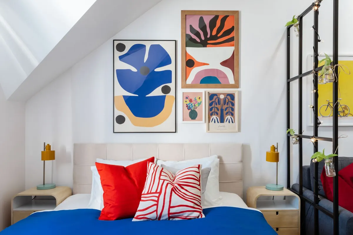
A gallery wall looks effortless when it works, which is exactly why so many go wrong. The prints are good, the frames are good, and then everything hangs slightly too high with gaps wide enough to park a bike in. The problem is rarely taste. It is almost always the setup — a few small decisions about height, spacing and planning that get skipped in the rush to get pictures out of their packaging.
None of the fixes below take long. Most of them take a tape measure, a pencil and ten minutes of patience before you pick up the drill.
Mistake 1: Hanging to standing eye level
Standing eye level sounds logical until you remember that it differs from person to person, changes as you move through a room and won't stay the same for the next twenty years. Working from a fixed measurement off the floor gives you consistency instead.
Most galleries and picture framers centre work at around 145cm from the floor to the middle of the piece, or to the middle of the group if you're hanging several. That suits rooms with standard ceilings and makes an arrangement look intentional rather than improvised. If you're tall, resist the urge to push it up. Guests, children and anyone sitting down will spend the evening looking at the underside of your frames.
Furniture shifts the maths. Above a sofa, the bottom edge of the arrangement wants to sit roughly 15–25cm above the sofa back: close enough to feel connected to the furniture, far enough that nobody's head knocks a frame as they stand up. In a dining room, pictures are seen while seated, so a group can drop to about 130–140cm to the centre. Hallways are the exception — people walk past rather than sit, so keep to the standard figure.
Mark a light pencil line at your chosen height across the area before you hang anything. Build the arrangement around it, then erase.
Mistake 2: Gaps that are too wide, too varied, or accidentally even
Spacing is the quiet detail that separates a collection from a pile of frames. As a rule of thumb, 5–8cm between frames reads well; drop to 4–5cm for small prints, and open up to about 10cm when you're hanging large pieces. The exact number matters far less than consistency. Three gaps of 4cm and one of 13cm will be read as a mistake, however lovely the artwork is.
Wide spacing also pulls a grouping apart. Prints and photographs register as one composition when they sit close together, and as unrelated objects when they don't. If you want an airy, sparse feel, keep the internal gaps tight and open up the margin around the whole arrangement instead — give it 15–20cm of clear wall on all sides, and more where it runs beside a doorway or a corner.
One more thing about gaps
Consistency includes the frame edges. A group where you've matched the distance between frames but not the distance between the outer edges will still look wobbly. Stand back and squint: the arrangement should read as a single shape with a clean outline, whether that shape is a neat rectangle or a loose cluster.
Mistake 3: Designing it on the wall instead of the floor
Holes are permanent until the filler dries, so do the awkward part first. Laying the arrangement out flat is the quickest way to spot that the small etching is too small next to the large landscape, or that two pieces you love side by side fight each other.
- Clear floor space roughly the size and shape of the wall area you're filling.
- Place your largest or favourite piece first, positioned where you want the eye to land.
- Build outwards from it, keeping gaps even and the outer outline reasonably tidy.
- Photograph the layout from straight on, then adjust anything that looks off in the photo. A camera flattens the arrangement in a way the eye can't.
- Trace each frame's outline onto lining paper, tape the paper to the wall, and mark every hook position directly on it.
- Drill through the paper, remove it, and hang. You should only need to measure once.
Lining paper also lets you live with the layout for a day. Walk past it in the morning with fresh eyes; if the big frame still bothers you, you've saved yourself two extra holes and a tin of filler.
Mistake 4: Trusting the hook more than the wall
Every wall behaves differently. Plasterboard, lath and plaster, and solid brick all need different fixings, and a hook rated for 5kg will not hold a glazed frame that weighs 8kg. Check the weight rating on the packaging and leave yourself a margin, because frames with glass and thick mounts are heavier than they look.
For anything large, use two fixing points rather than one — it keeps the frame level, stops it rotating on the hook and spreads the load. Very heavy pieces are best screwed into a stud or fixed with a properly rated wall fixing. Stick small felt pads on the bottom corners of each frame so it sits flat against the wall, doesn't tilt and doesn't mark the paint. If you rent, it's worth checking your tenancy agreement before making large holes.
Mistake 5: Alignment that only looks straight
Decide the rule before you hang: are the top edges aligned, the centres, or the bottom edges? Top-aligned works well above furniture. Centre-aligned suits mixed frame sizes. Bottom-aligned is neat for a row of same-height pieces on a narrow wall. Whichever you pick, apply it consistently, and check every frame with a spirit level rather than assuming the first one set the standard.
Then check against the room. In older houses, a line that is perfectly level can look wrong next to a sloping cornice or a ceiling that has settled, and it's often better to follow the room by a centimetre or two than to fight it. Dark frames and wide mounts hide small misalignments; slim pale frames reveal every millimetre, so give those extra care.
Finally, look from three positions: standing well back, crouched at seated height, and from the doorway. Faults that vanish up close are obvious from across the room.
The five-minute check before you drill
- Centre line marked at roughly 145cm, adjusted for furniture in the room
- Gaps even to within a centimetre of each other
- Largest piece placed first, smaller items grouped around it
- Layout photographed and paper outlines taped up before any holes are made
- Fixings rated above the weight of the frame and glass, and matched to the wall type
- Spirit level to hand, and a pencil mark for every hook
A gallery wall doesn't need perfect symmetry or a large budget. It needs a decided centre line, gaps you'd be happy to measure in front of a guest, and a layout you tested before the first hole appeared. Get those three things right and the arrangement can be as crowded or as sparse as you like — it will still look as though someone meant it.
Photo: TurnKey Apartments / Pexels